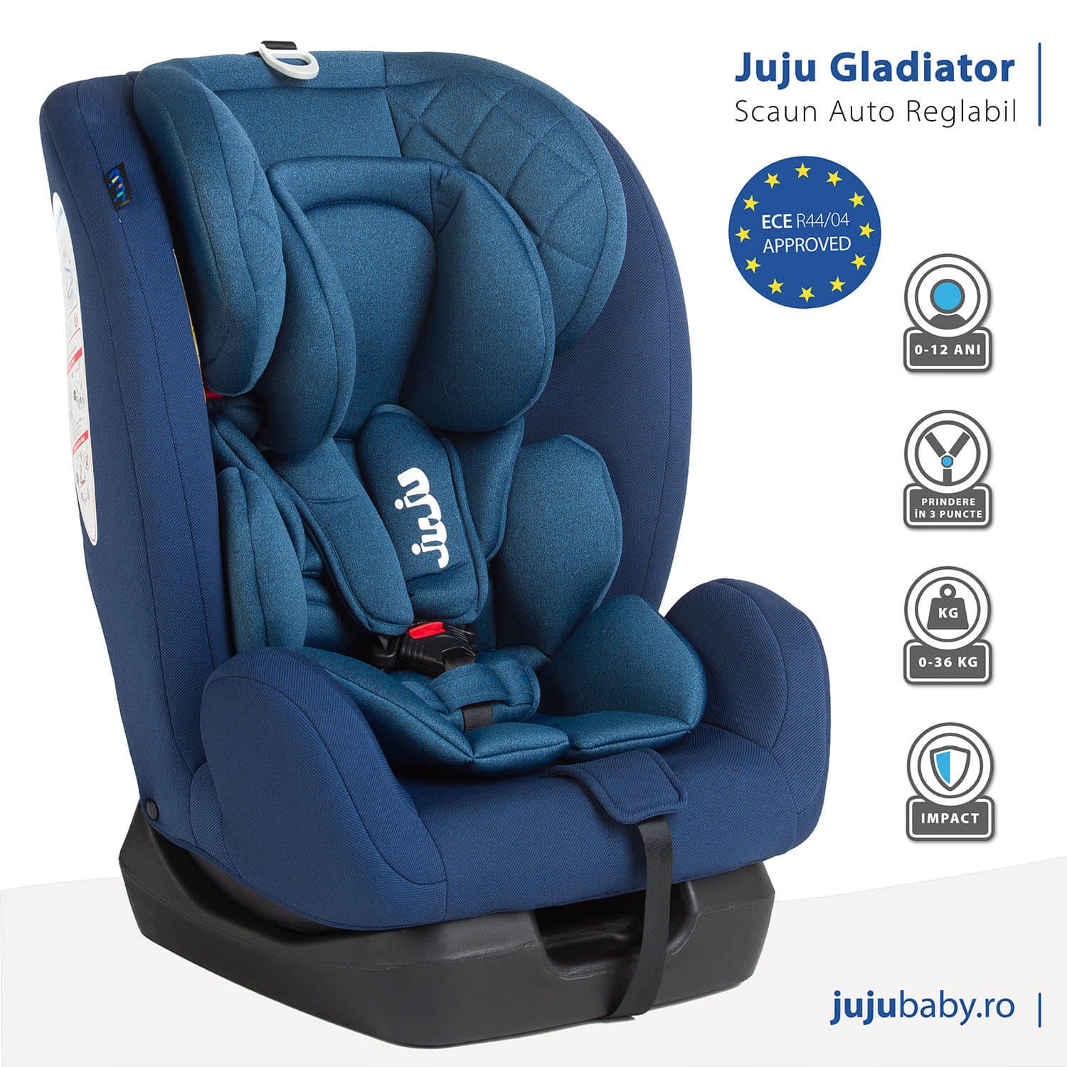
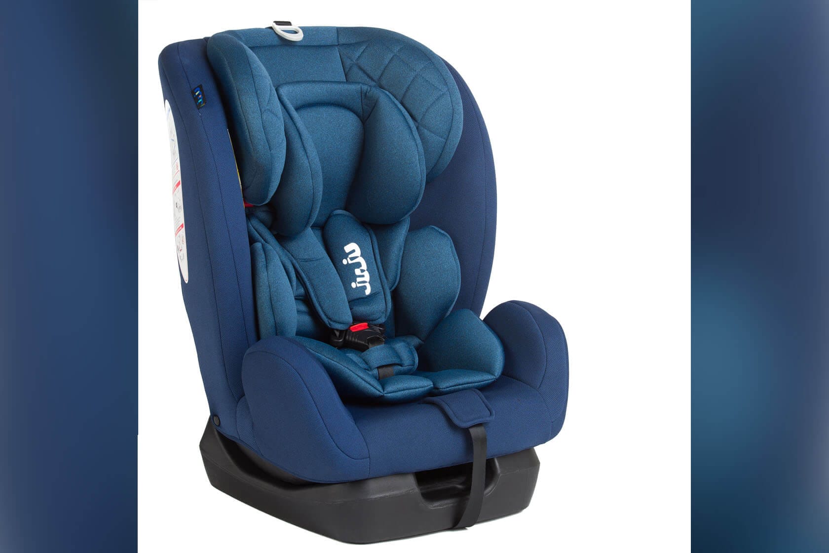
For this project, I transformed the original product photo into a clean, professional marketing image that aligns with current e-commerce standards, especially in the baby and parenting niche.
The process began with light photo cleanup in Photoshop, removing minor distractions from the background, slightly improved lighting, and made subtle color corrections to enhance the seat’s texture and tone while keeping it true to the real product.Â
After finishing the photo adjustments, I imported the edited image into Adobe Illustrator to prepare the layout for presentation.
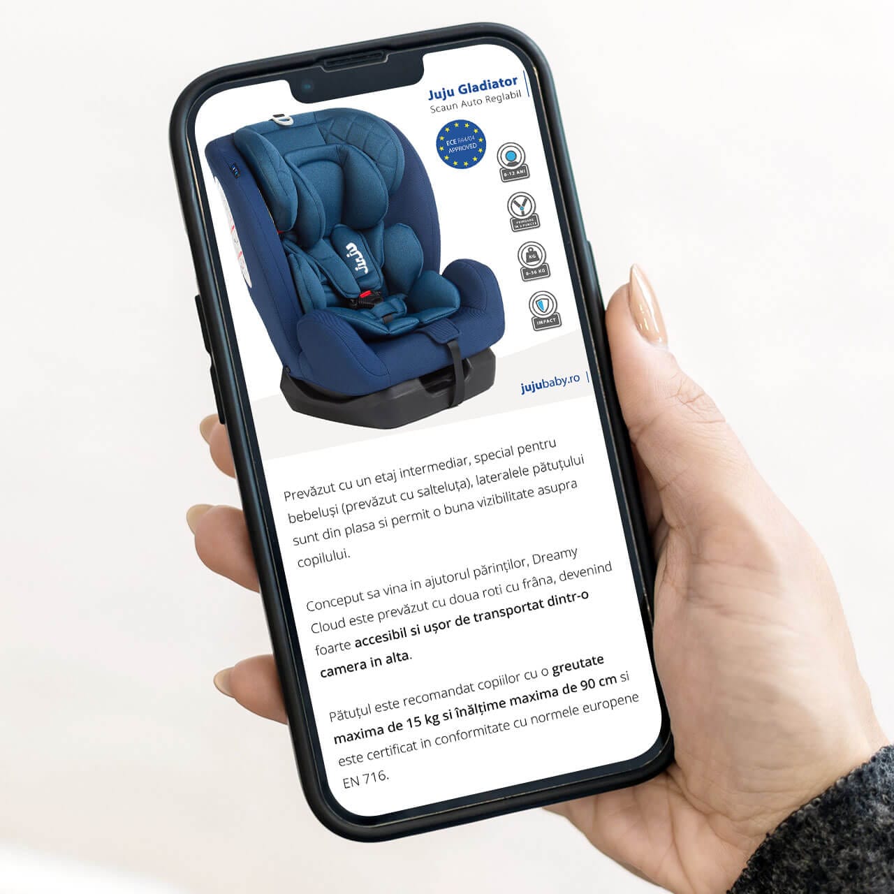
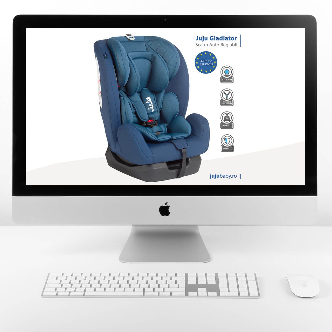
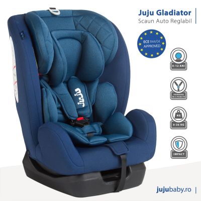
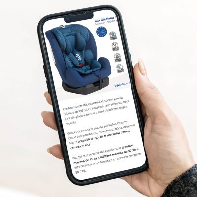
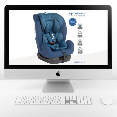
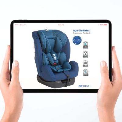
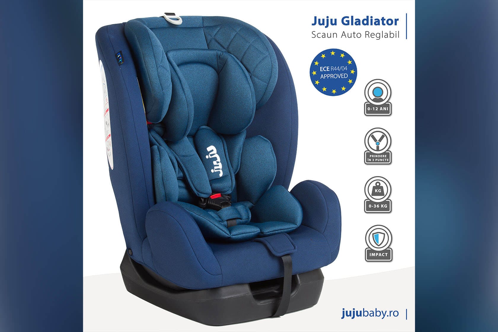
The goal here was to create a product image that not only looks clean and modern but also communicates essential information at a glance, just like successful listings on major e-commerce platforms.
In Illustrator, I placed the image on a two-tone background, combining white and soft grey curves to subtly frame the product and give it a light, airy feel.
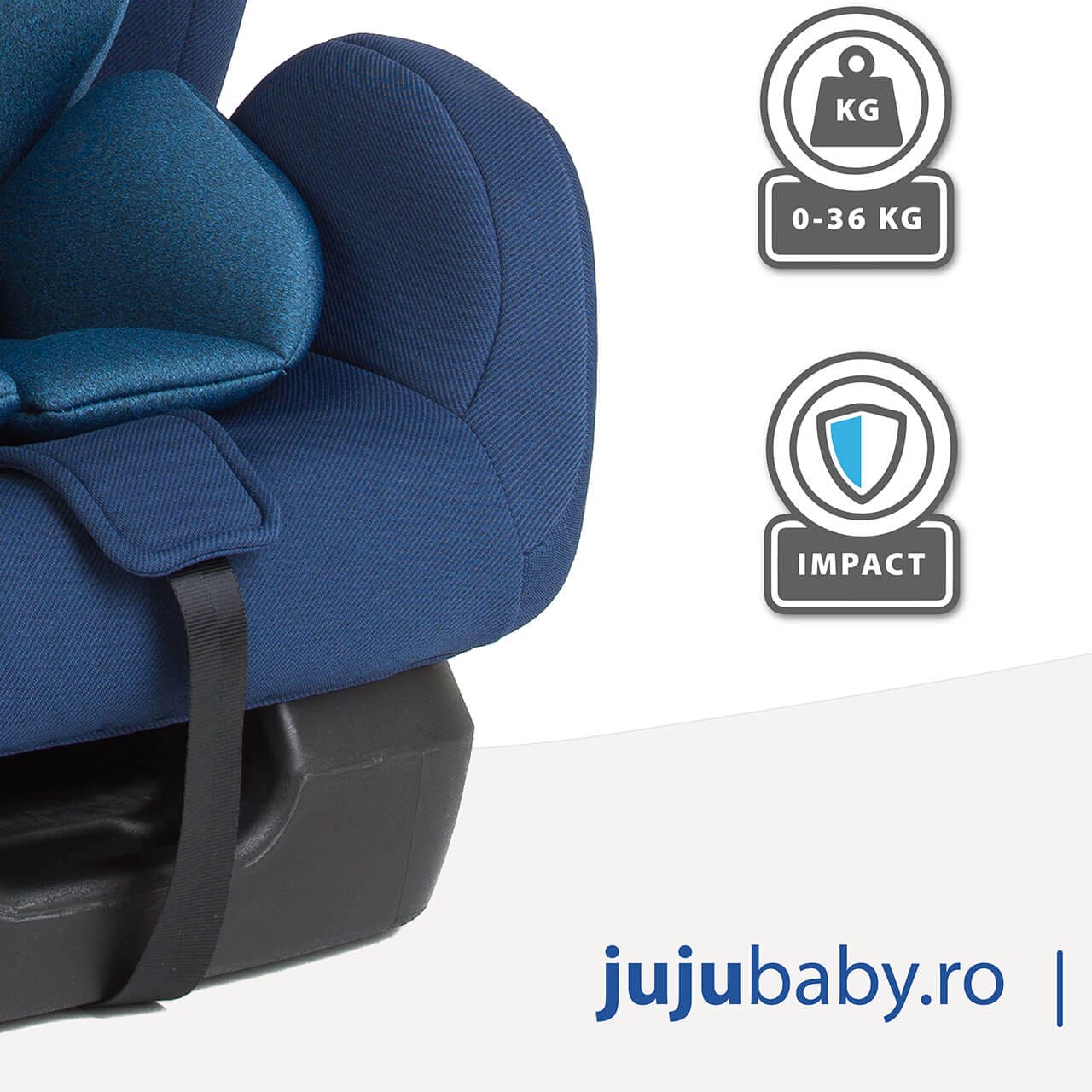
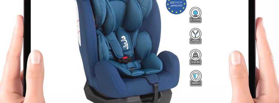
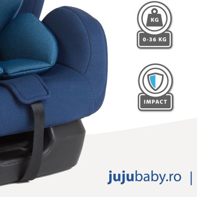
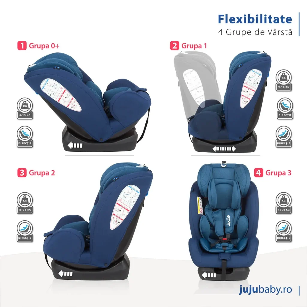
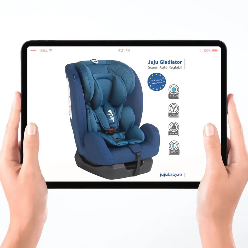
I designed a set of custom icons to visually communicate key product features, including age range (0–12 years), weight capacity (0–36 kg), 3-point harness system, and impact protection.
These icons were arranged vertically along the right side of the image for easy readability.
I also created a badge-style element featuring the ECE R44/04 approval to reinforce product safety compliance, a strong selling point for parents.
Clear, easy-to-read typography was added next to the icons and brand name to keep the information direct and visually balanced.
The end result is a polished, user-friendly product image that builds trust and encourages engagement from online shoppers.
Category
Services, Presentation, E-commerce
Tags
#wordpress, #design, #photoshop, #retouch, #optimize
Skills used
For this project, I transformed the original product photo into a clean, professional marketing image that aligns with current e-commerce standards, especially in the baby and parenting niche.
The process began with light photo cleanup in Photoshop, removing minor distractions from the background, slightly improved lighting, and made subtle color corrections to enhance the seat’s texture and tone while keeping it true to the real product.Â
After finishing the photo adjustments, I imported the edited image into Adobe Illustrator to prepare the layout for presentation.
The goal here was to create a product image that not only looks clean and modern but also communicates essential information at a glance, just like successful listings on major e-commerce platforms.
In Illustrator, I placed the image on a two-tone background, combining white and soft grey curves to subtly frame the product and give it a light, airy feel.
I designed a set of custom icons to visually communicate key product features, including age range (0–12 years), weight capacity (0–36 kg), 3-point harness system, and impact protection.
These icons were arranged vertically along the right side of the image for easy readability.
I also created a badge-style element featuring the ECE R44/04 approval to reinforce product safety compliance, a strong selling point for parents.
Clear, easy-to-read typography was added next to the icons and brand name to keep the information direct and visually balanced.
The end result is a polished, user-friendly product image that builds trust and encourages engagement from online shoppers.
Skills used
For this project, I transformed the original product photo into a clean, professional marketing image that aligns with current e-commerce standards, especially in the baby and parenting niche.
The process began with light photo cleanup in Photoshop, removing minor distractions from the background, slightly improved lighting, and made subtle color corrections to enhance the seat’s texture and tone while keeping it true to the real product.Â
After finishing the photo adjustments, I imported the edited image into Adobe Illustrator to prepare the layout for presentation.
The goal here was to create a product image that not only looks clean and modern but also communicates essential information at a glance, just like successful listings on major e-commerce platforms.
In Illustrator, I placed the image on a two-tone background, combining white and soft grey curves to subtly frame the product and give it a light, airy feel.
I designed a set of custom icons to visually communicate key product features, including age range (0–12 years), weight capacity (0–36 kg), 3-point harness system, and impact protection.
These icons were arranged vertically along the right side of the image for easy readability.
I also created a badge-style element featuring the ECE R44/04 approval to reinforce product safety compliance, a strong selling point for parents.
Clear, easy-to-read typography was added next to the icons and brand name to keep the information direct and visually balanced.
The end result is a polished, user-friendly product image that builds trust and encourages engagement from online shoppers.
Skills used
Category
 Art Retouching
Tags
#photoshop, #retouch, #optimize
get in touch
Before & After