


Juju Dreamy Cloud

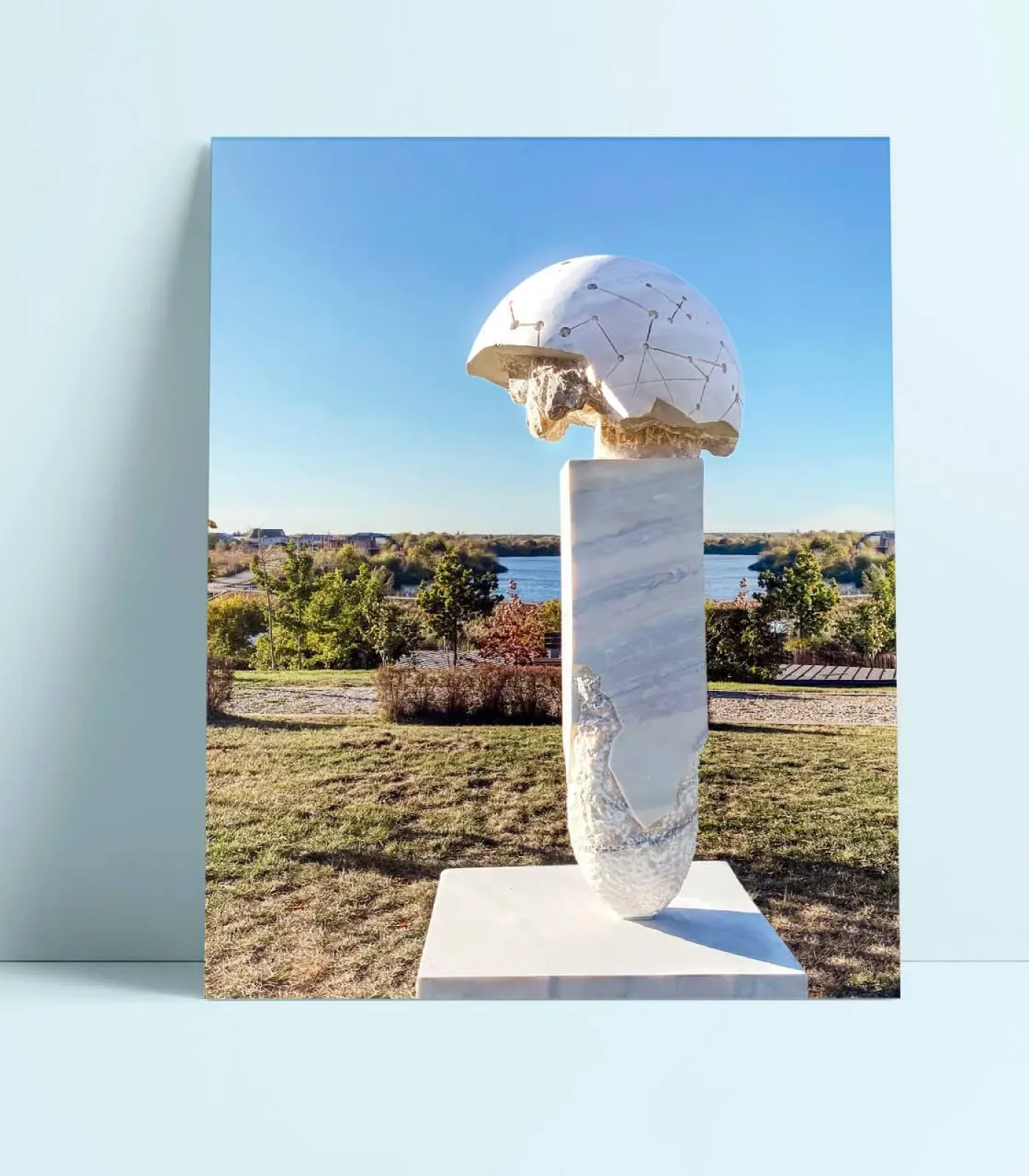
Planetary Fossil

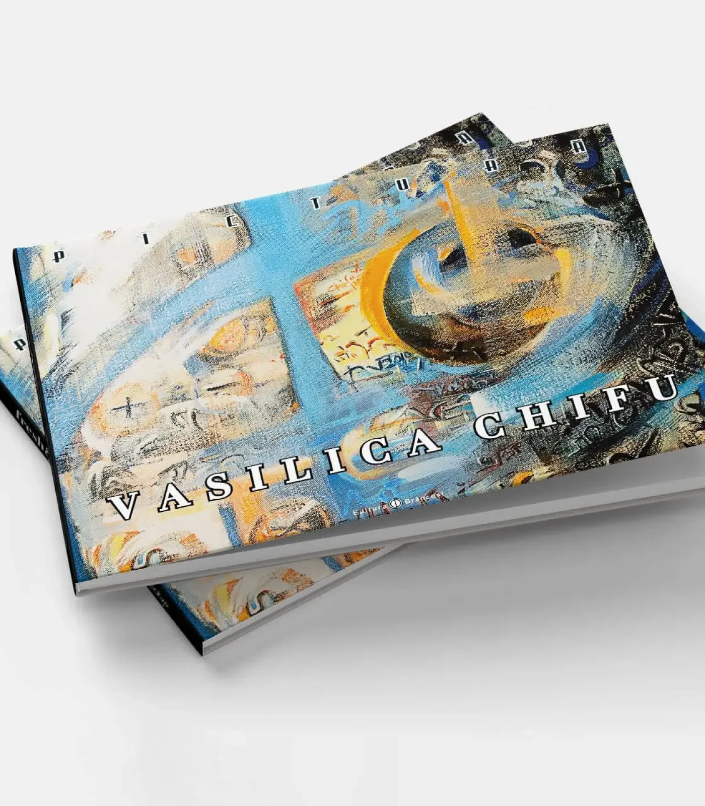
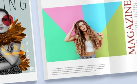
Painting Catalog

Dreamy Cloud Crib

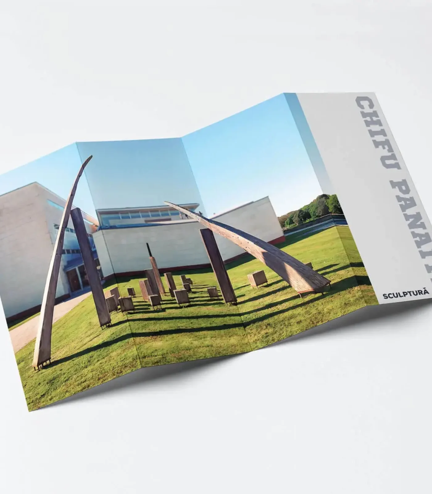
Juju Gladiator


Sculpture Catalog
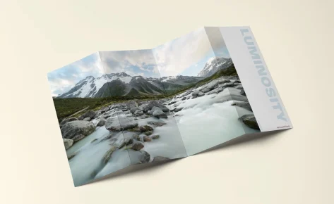
Parâng Mountains

Jujutoys.ro


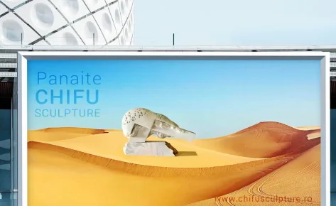
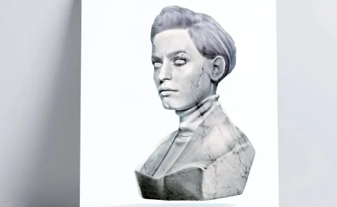
“Universal Fragment” -CHIFU

E-commerce Ready

The Journey


Handmande Earrings

Handmande Earrings

Handmande Earrings

Handmande Earrings

Handmande Earrings

Orbital Neckless

Handmade Neckless

Colored Earrings

Flower Earrings

Vibrant Green Earrings


Radical of Infinite


Change Background Color
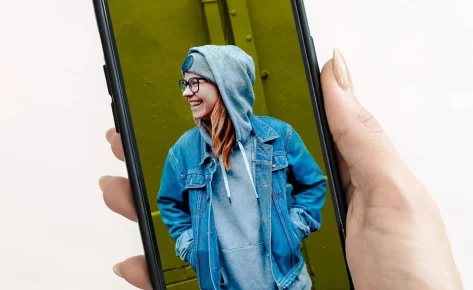
Background Change
in Retouching Visual


Header R.M.23
in Compositing
Blending Shutterspeed
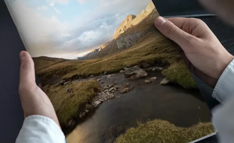
Maps and Roads
River Retouching

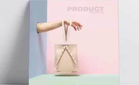
Pink Handbag

Three Leather Handbags
Recovering Bright
Coloring with Luminosity Masks

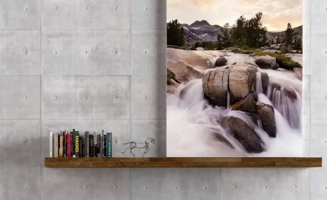
Landscape Exposure Bleeding
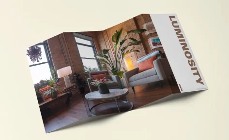
Interior Design
Leather Handbag

Stools
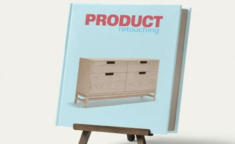
Oak Dresser

Close-up Retouching

Still Life Retouching

Product Retouching

The Great Savana

Portrait Retouching

Frequency Separation

Frequency and Separation
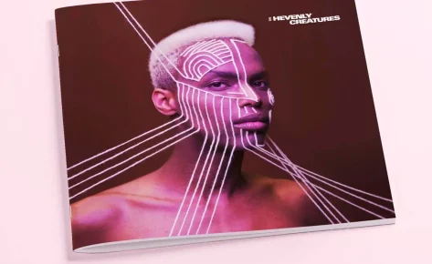
Heavenly Creatures

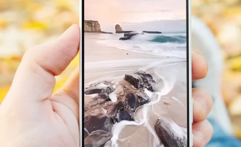
The Wave

Desert Spirits

Profesional Retouching

Headshot Retouching
The Black Queen
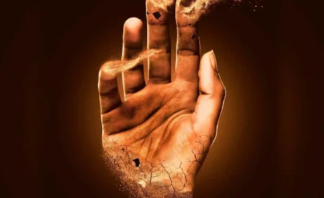
The Brown Hand
in Retouching Visual

The Blue Planet

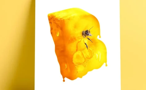
The Green Dragon

The Orange Bird
The Yellow Prison
The White Rock

Romanian Navy Day
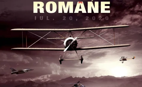
Romanian Aviation and Air Forces Day

Romanian Army Day
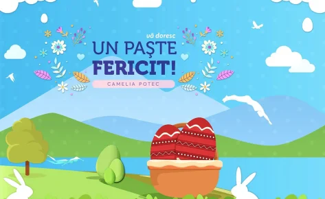
Happy Easter
in Visual

Happy Easter
in Visual

Romanian Land Forces Day

Happy New Year

GDA 2021 Cover
in Visual

Merry Christmas
in Visual
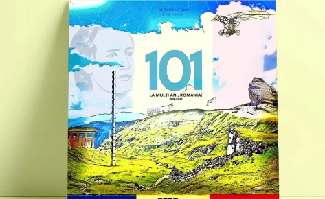
Romanian National Day

GDA 2019 Posters
in Visual

GDA 2019 Official Poster
in Visual

Simple Product Retouching

Still Life Fixes

Simple Reflexion Removal
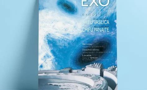
EXO Exhibition Poster
in Visual


